EOS
Premium nicotine pouch concept brand designed for clarity, control, and discretion in fast-paced urban environments.
Strategy-led brand and packaging system translating the concept “ABOVE THE NOISE” into a disciplined visual language inspired by elevation and precision.
Project Context
Sodano AG
In-house
Nicotine pouches
Lead
Zürich
Disciplines
Brand Strategy
Brand Identity
Packaging
Art Direction
Print Production
Role
Led brand strategy and packaging design for a premium nicotine pouch concept.
Defined positioning, target persona, and competitive landscape to establish a clear premium differentiation.
Designed the EOS identity and scalable packaging system including logo device, graphic language, and flavour-coded variants.
Work Overview
Brand Strategy

Brand Identity

Packaging
Product Architecture
Brand Strategy
Role
- Defined the customer problem, target persona, and competitive landscape.
- Established positioning, archetype, and communication principles to guide all design decisions.
- Translated strategy into clear system constraints for identity, packaging, and navigation
Brand Identity
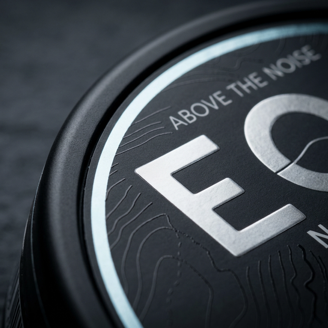
EOS builds a calm, trust-led identity system using elevation as a metaphor for clarity and orientation. The system is anchored by the EOS wordmark and a signature “O” cut by a line that suggests both the horizon and mountain elevation, supported by a topographic pattern language that scales cleanly across touchpoints.
Role
Designed the EOS wordmark and the signature “O” device as a modular identity element.
Defined the topographic contour pattern as the core graphic language for consistency and repetition.
Set the brand voice and expression principles to keep the identity precise, calm, and not hype-driven.
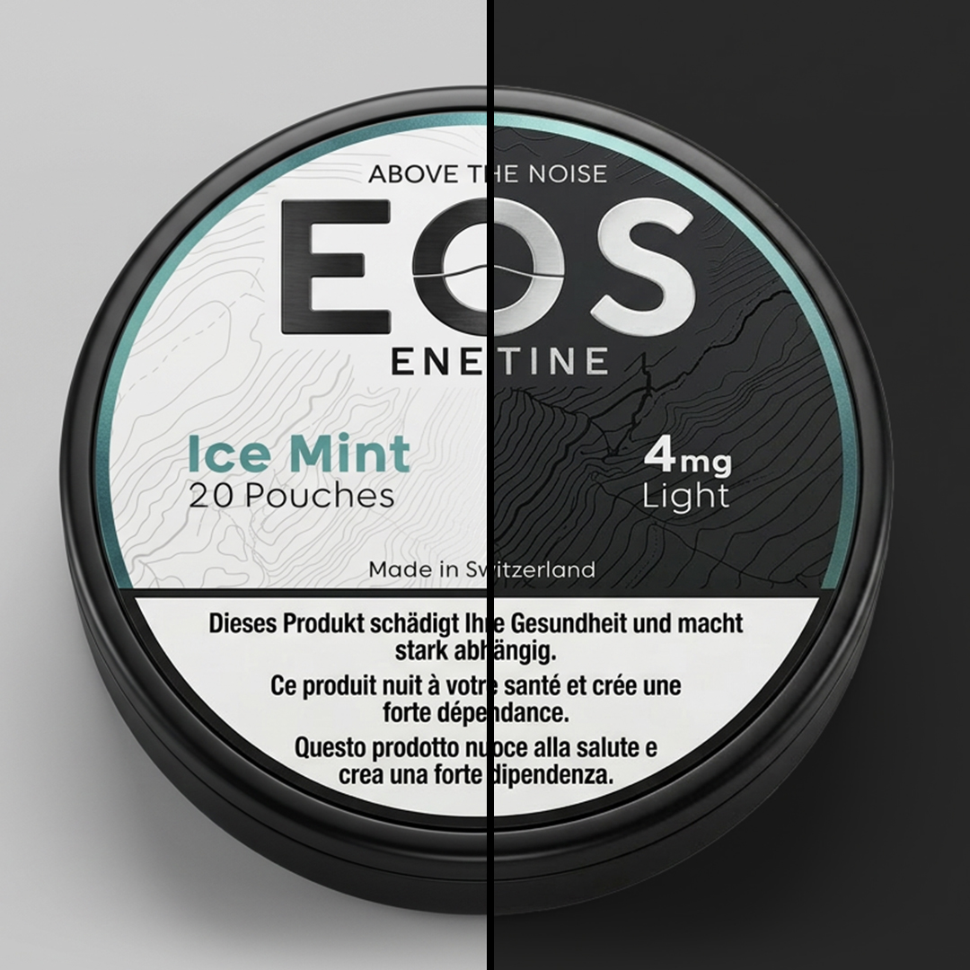
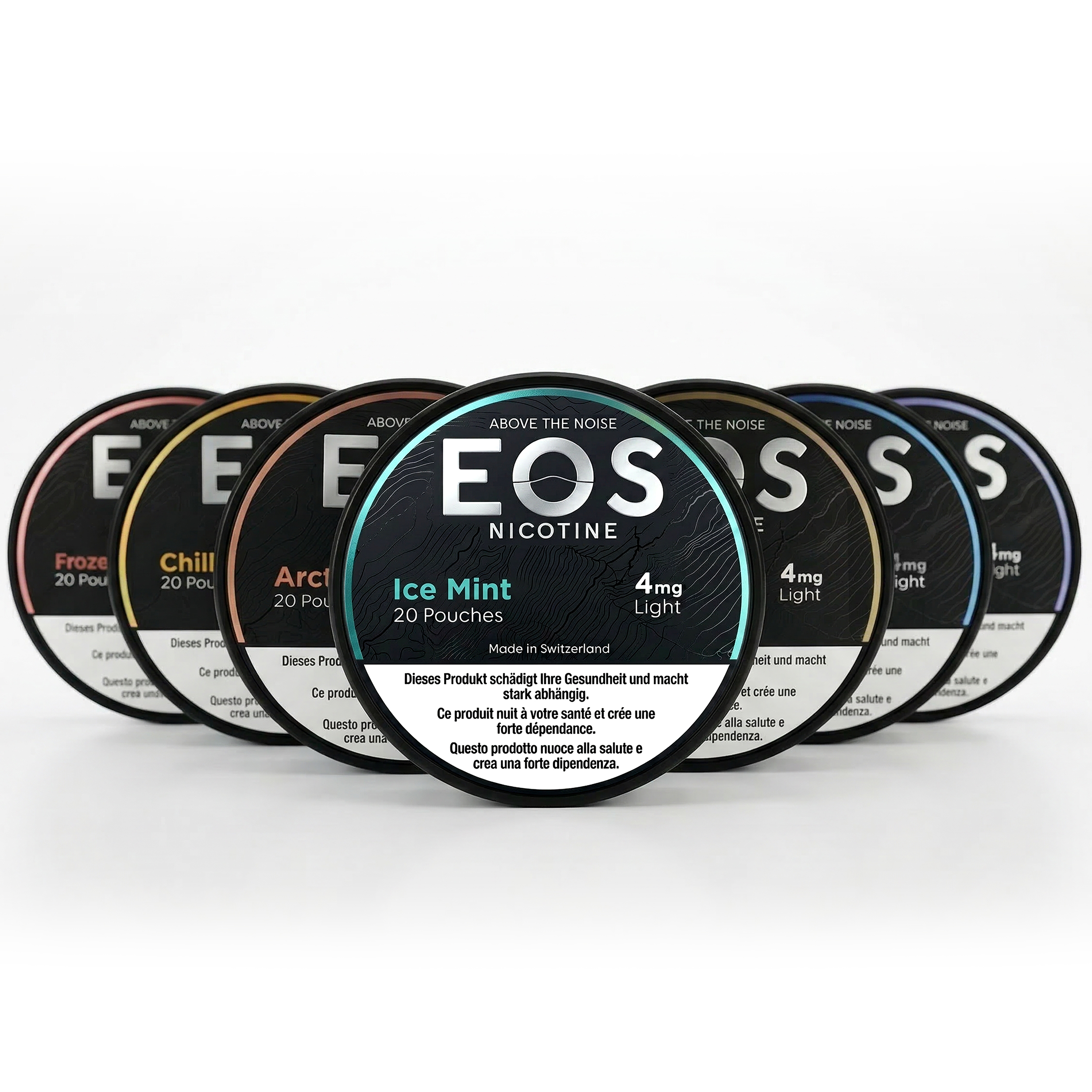
Packaging & SKU System
Role
- Designed the label layout rules and hierarchy to prioritize scan speed and clarity.
- Defined the finish system: matte chrome EOS signature block with metallic/iridescent variant accents and subtle spot-UV texture.
- Built the variant logic for flavour and strength tiers so new SKUs can be added without changing the core structure.
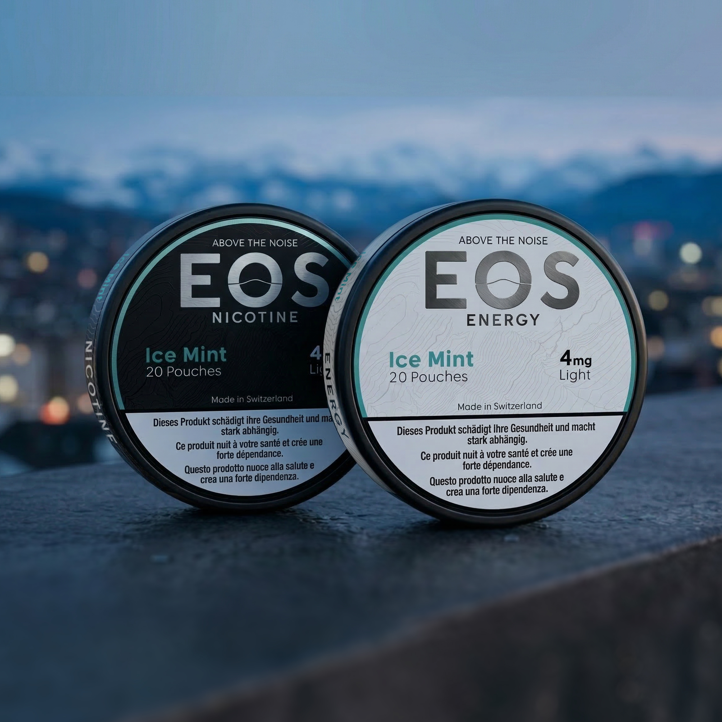
Product Architecture
Role
-
Defined the dual-line structure and how both lines share one core system (identity, hierarchy, finishes).
-
Adapted the packaging base (black for nicotine, white for energy) while keeping the same navigation logic.
-
Set extension rules so future functional lines can be added without breaking brand consistency.
Contribution & Impact
As in-house designer, I led EOS from early category framing and concept ideation to a complete identity and packaging system designed for long-term consistency. I established the guiding vision—elevation as a metaphor for composure and control—and translated it into repeatable rules for hierarchy, pattern language, finish behavior, and variant logic so the system scales across flavours, strengths, and a dual-line structure (Nicotine + Energy) without brand drift.
The result is a disciplined packaging and SKU system built for fast navigation and a controlled premium tone. By standardizing what stays constant and what changes, EOS can expand into new variants and product lines while maintaining clarity and a unified brand experience.