Japanese restaurant located in Zürich’s main station, designed for high traffic, fast service, and immediate recognition.
Development of a distinctive identity mark translating cultural meaning into a clear and scalable visual form.
FCB Zürich
Agency
Restaurant
Team-based
Zürich
Logo Design
Concept Development
Visual Research
Led concept and design development within a collaborative team.
Defined the visual direction and symbolic approach.
Designed and executed the final identity mark.
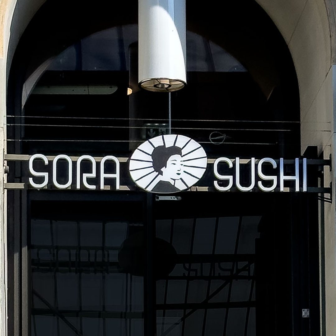
Located within Zürich’s central station, the project required a mark that performs in a fast moving environment.
The identity needed to be instantly recognizable, legible at distance, and adaptable across signage and packaging.
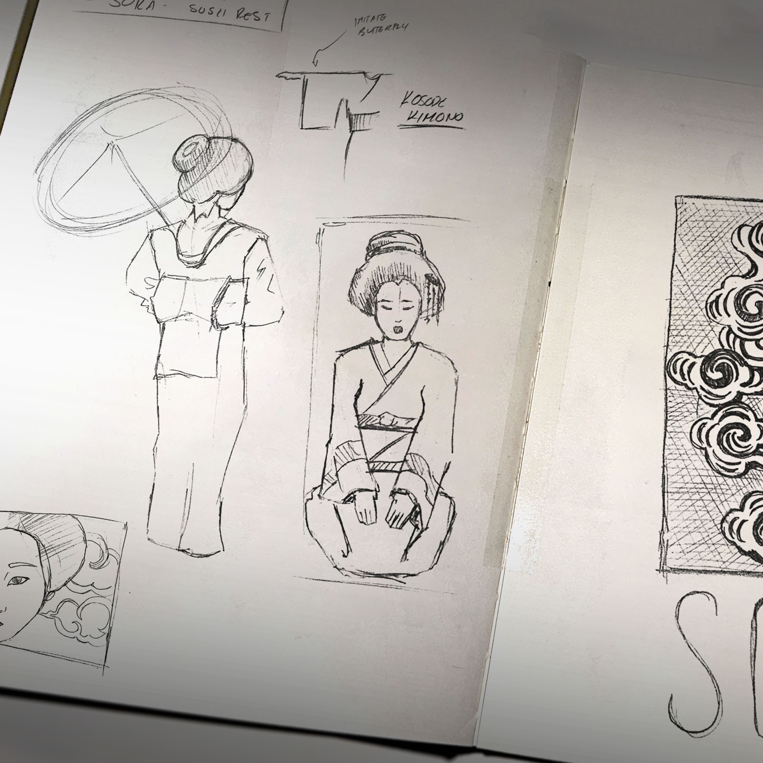
The direction draws from traditional Japanese woodblock prints, umbrella structures, and ink stamp aesthetics.
These references were reduced into essential forms to balance cultural depth with clarity and usability.
Exploration focused on translating symbolic elements into a simplified and functional form.
The combination of geisha and umbrella emerged as the most effective direction, refined through iterative reduction and proportion control.
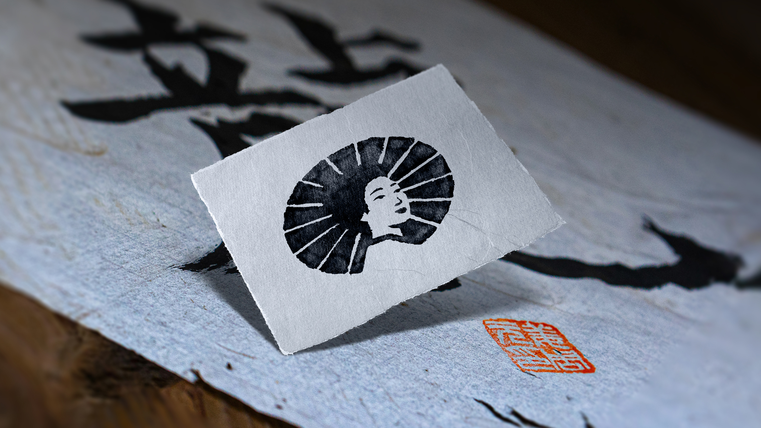
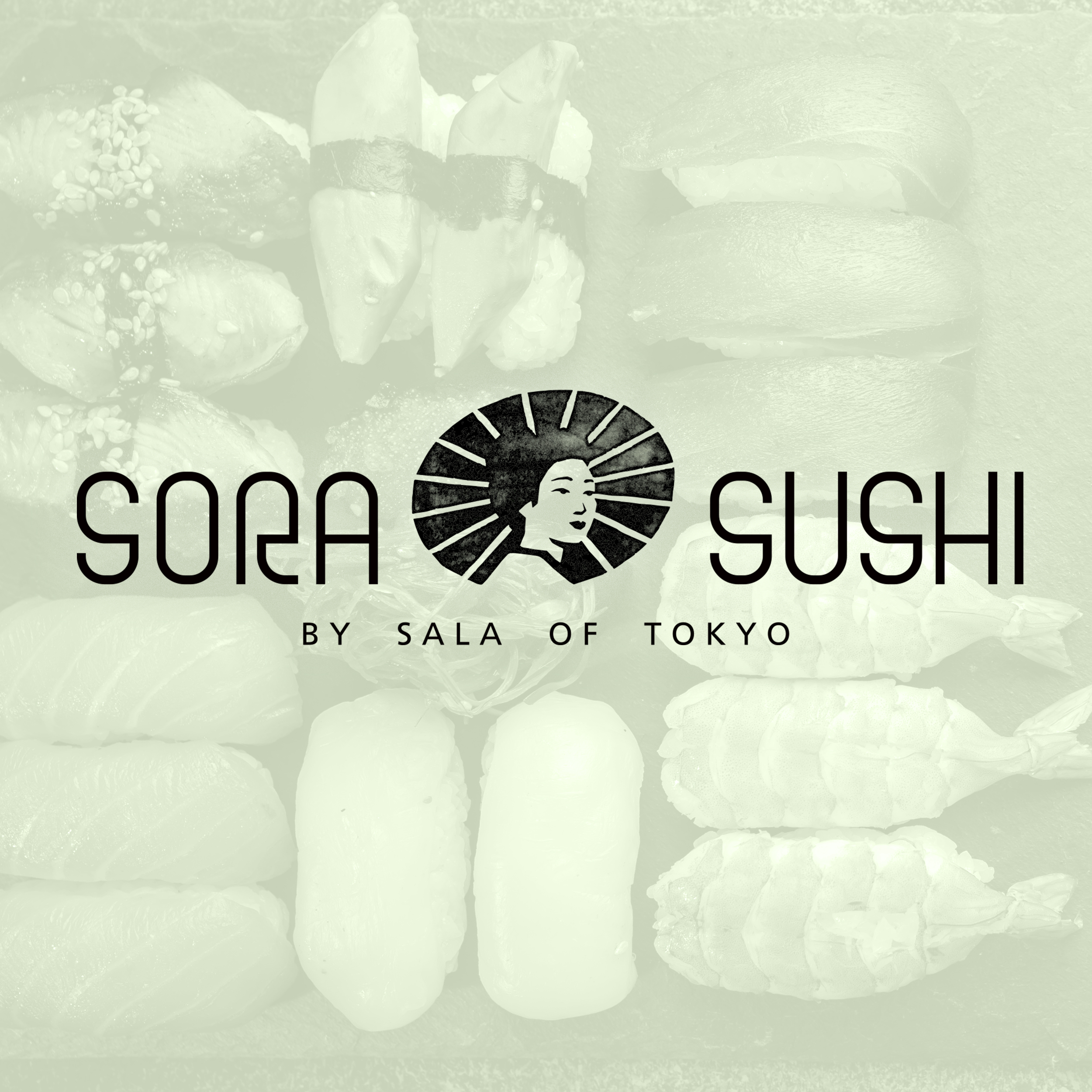
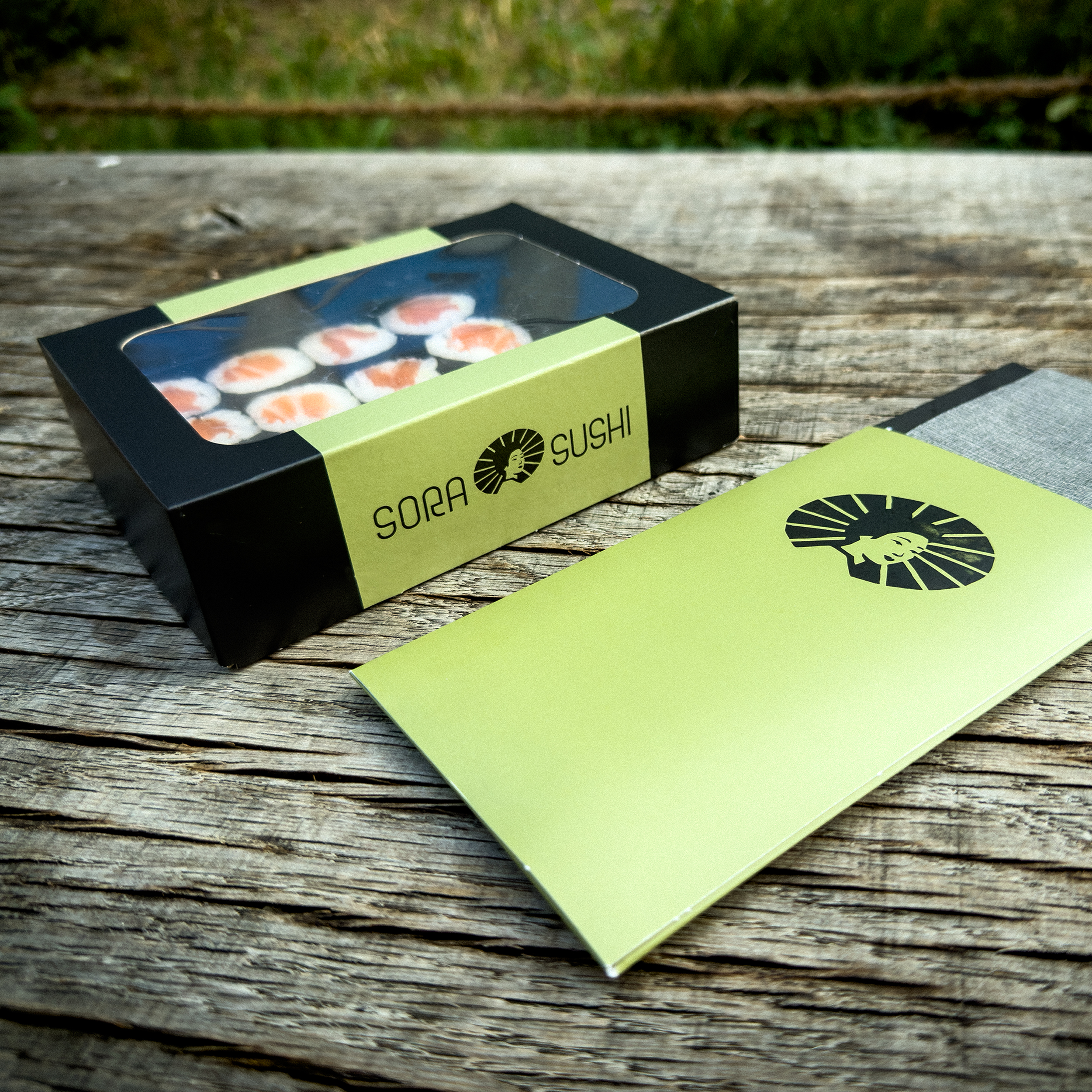
The final mark integrates a geisha within the structure of a Japanese umbrella, forming a compact and distinctive symbol.
The form is designed to remain legible and recognizable across scales, from small packaging applications to large scale signage.
The accompanying typography remains neutral, supporting the symbol without competing for attention.
The mark translates effectively across real world applications, particularly in packaging and storefront signage.
Its structure ensures visibility in a high traffic environment, maintaining clarity both in motion and at close range.
This project demonstrates the ability to translate cultural meaning into a reduced and functional identity mark.
Within a collaborative agency environment, the role extended beyond execution into defining direction and shaping the final outcome.
The result is a symbol that balances expression, clarity, and usability across contexts.